Rolling out a new identity
We had the opportunity to work on marketing material for Wasabi, which allowed us to
dive deep into the brand’s identity and overall market presence. Our experience revealed
that while Wasabi has a solid foundation and a loyal customer base, there is significant
potential for growth by modernising its image and messaging. After researching the
Wasabi brand, we noticed a lack of coherent language and a disconnect from Wasabi’s
values and rich history. The logo appeared tired and outdated, and there were even two
different logos with no clear indication of which was primary. The website had one style,
while the shops had another, and the social media presence was low-budget at best. I
aimed to refresh the brand by creating a new logo that would unify all aspects of the
brand and better reflect its identity.
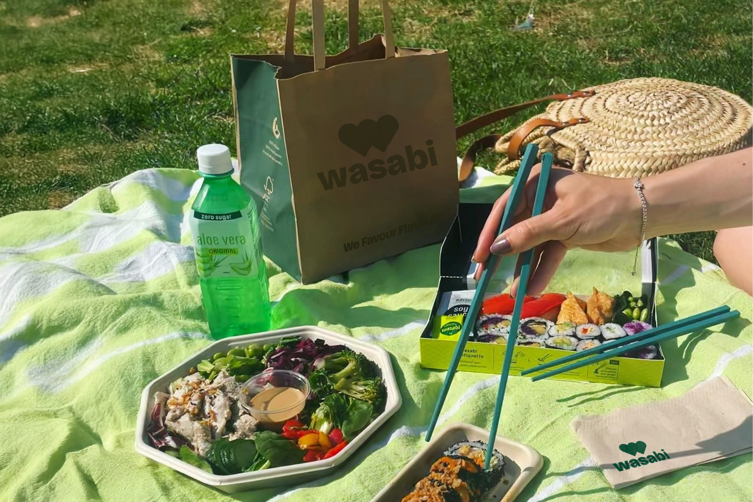
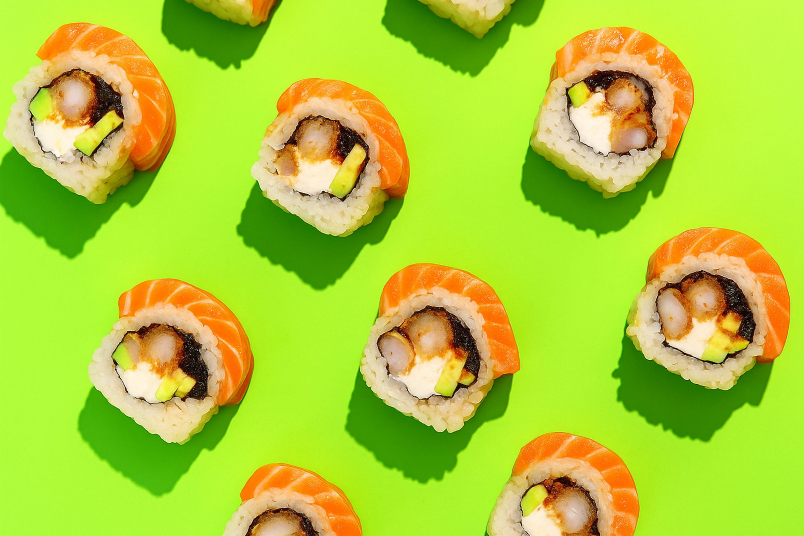
A fresh take on takeaway
Takeaway food has experienced a significant surge in recent years, largely driven by
home delivery services like Just Eat, Uber Eats, and Deliveroo. We saw an opportunity to
tap into this growing market by offering sushi and bento as a fresh alternative to
traditional takeaway options. By doing so, we aim to not only expand our market share
but also attract a new generation of sushi enthusiasts—many of whom may not have
realised their love for sushi until now
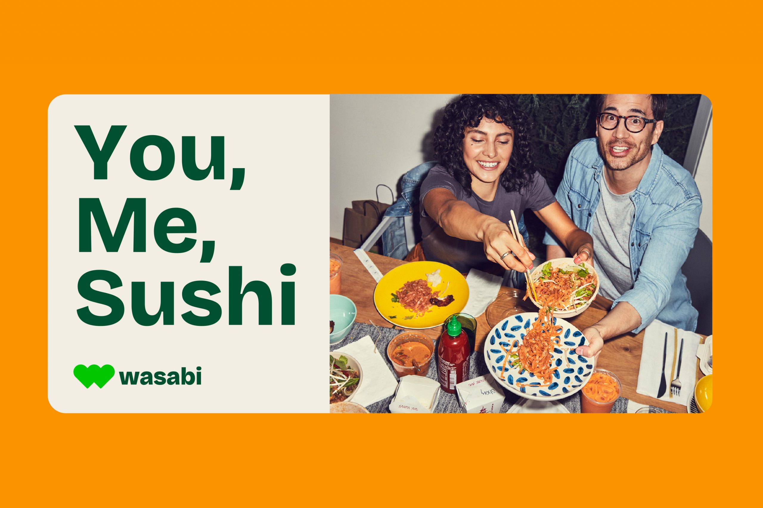
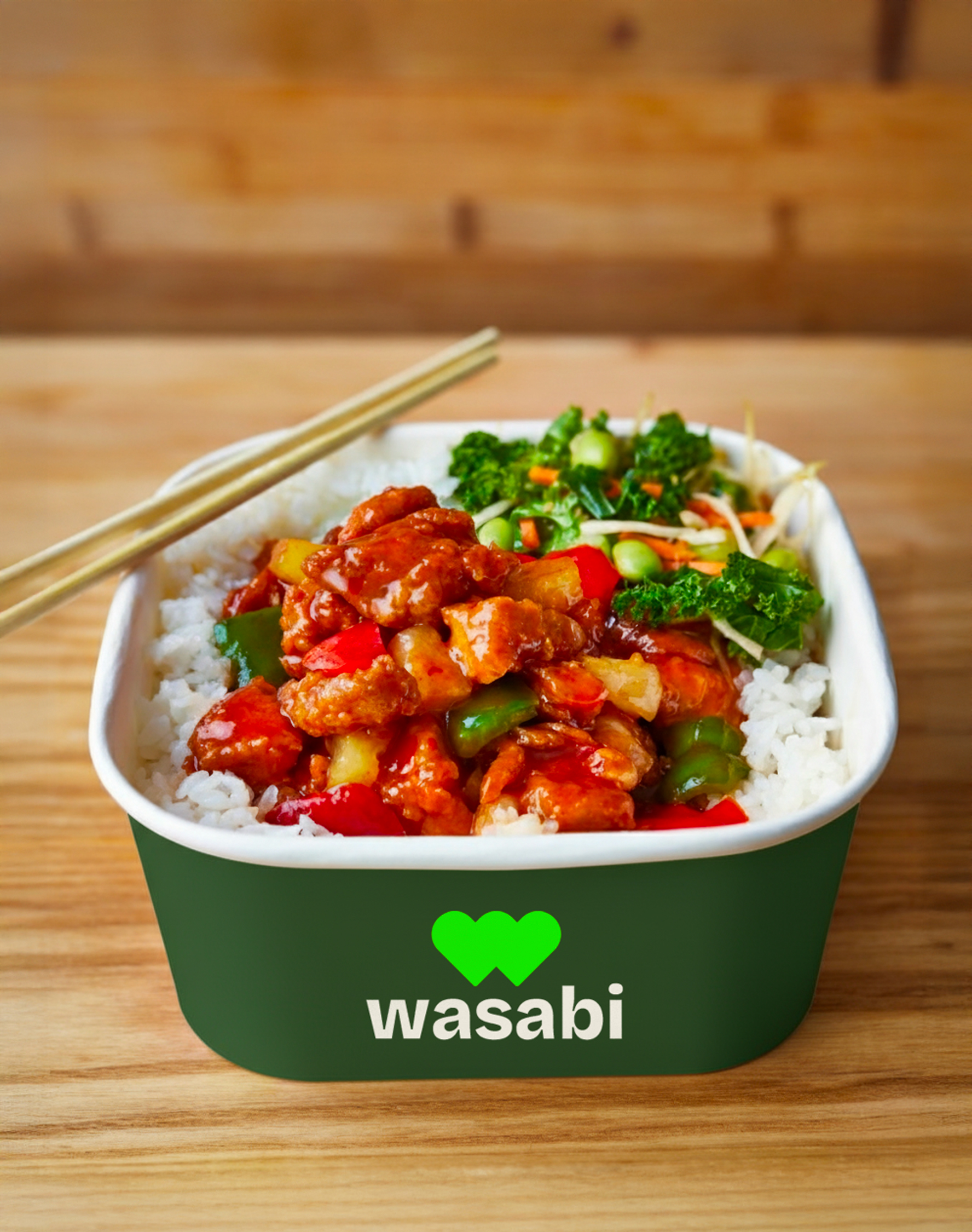
Passion, united
For the logo, we wanted to highlight what makes Wasabi unique: a genuine love for both
sushi and bento. These two passions became the foundation for the design. we created a
logo featuring two hearts, one representing sushi and the other bento, which together
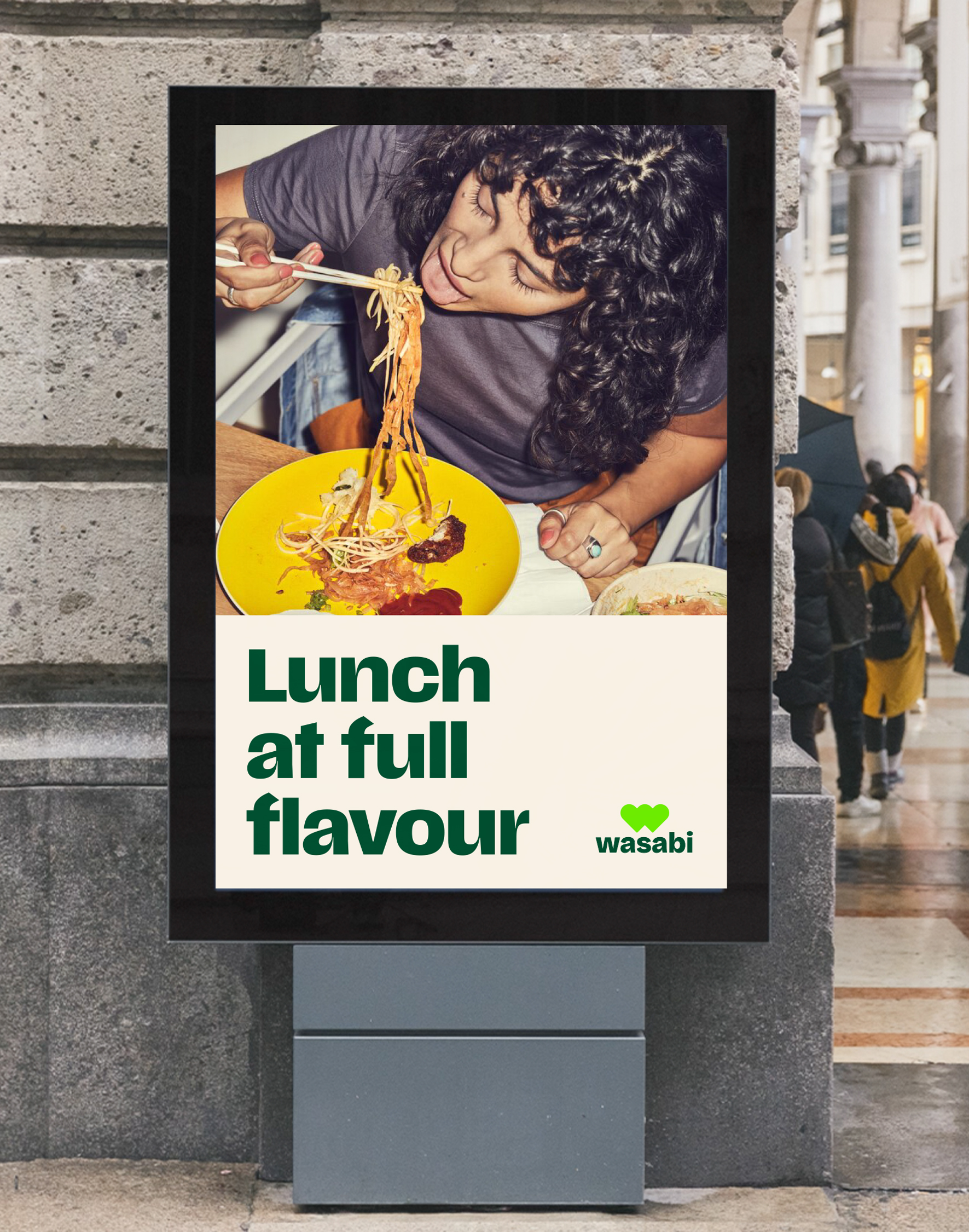
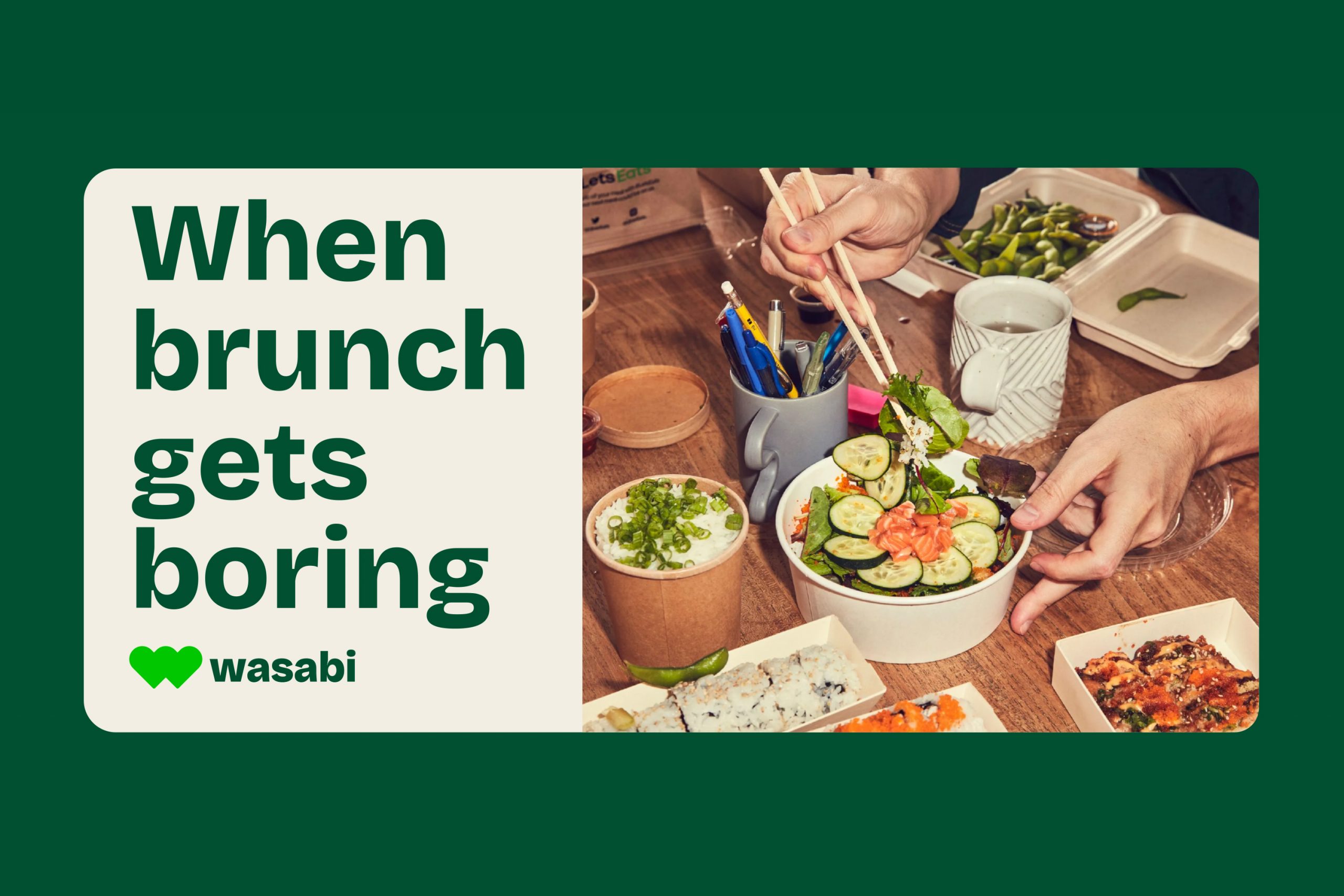
formed a boldand stylish “W.” To enhance this new identity, we incorporated modern
photography to appeal to Gen Z and chose a vibrant colour palette that pays homage to
Wasabi’s street food origins