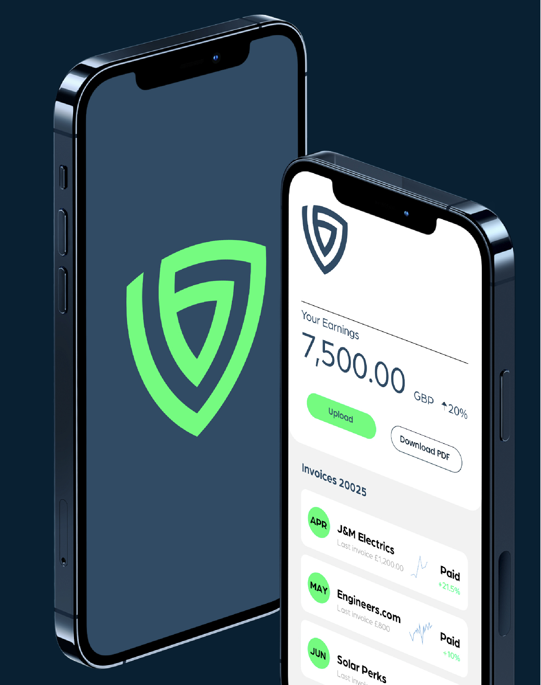
Block Debt


While their name and reputation was a solid one, we looked at what’s truly important to them - what gets them up in the morning - as a foundation to build a stronger, more impressive brand identity. Part of our work would need to focus on the what makes them special, while emphasising their own future goals. Their work culture and ethical drive were front and centre in their old brand, but much of what they actually do (and what the core benefits for customers old and new) were nowhere to be seen. Their website was a manifesto for their commendable way of working, but it didn’t tell customers what they did - or why they should work with them. Likewise their logo and colour scheme were not memorable and relegated them to the pack of a crowded market. It was crucial to refocus, and create a brand that would instantly show them at their best.
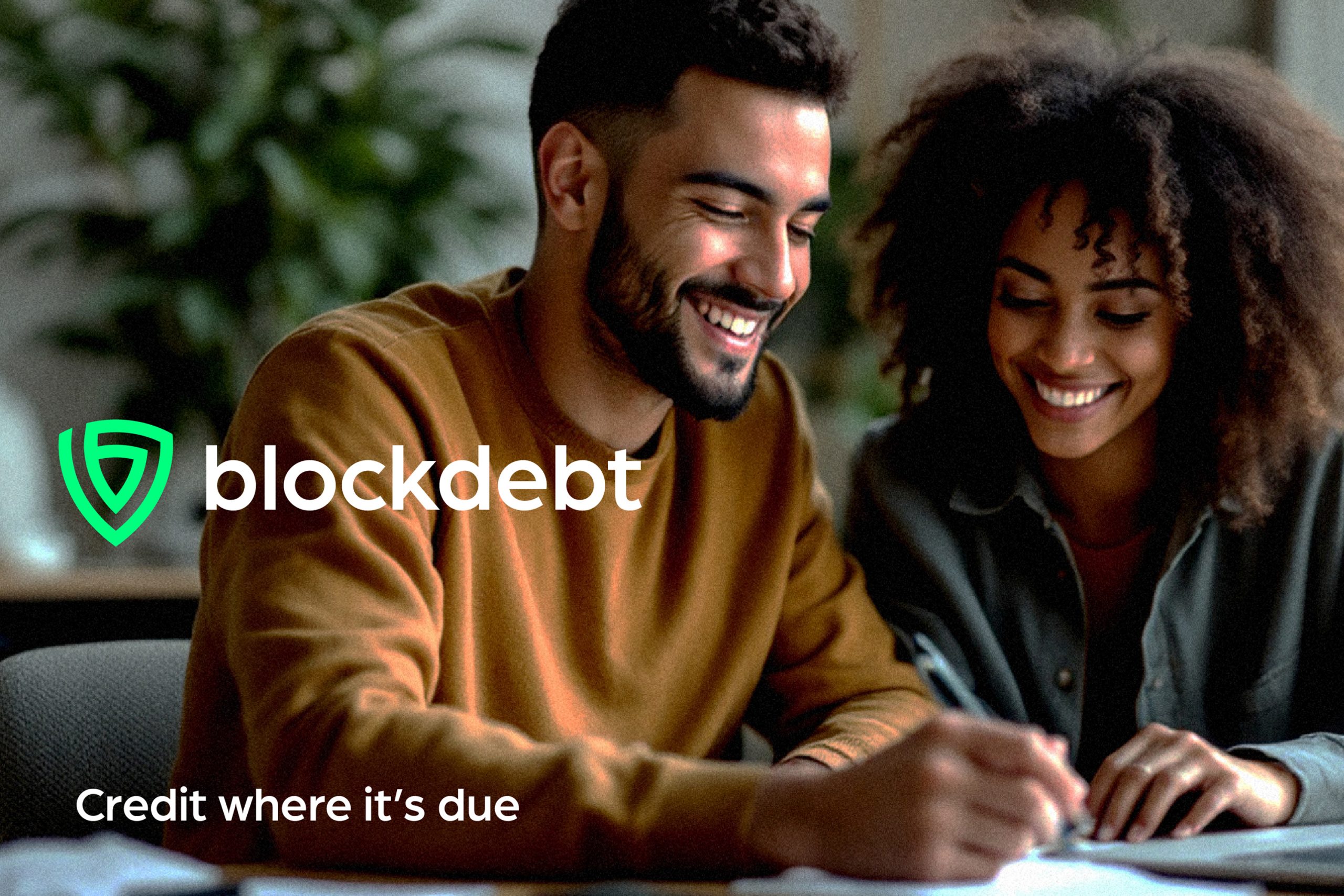
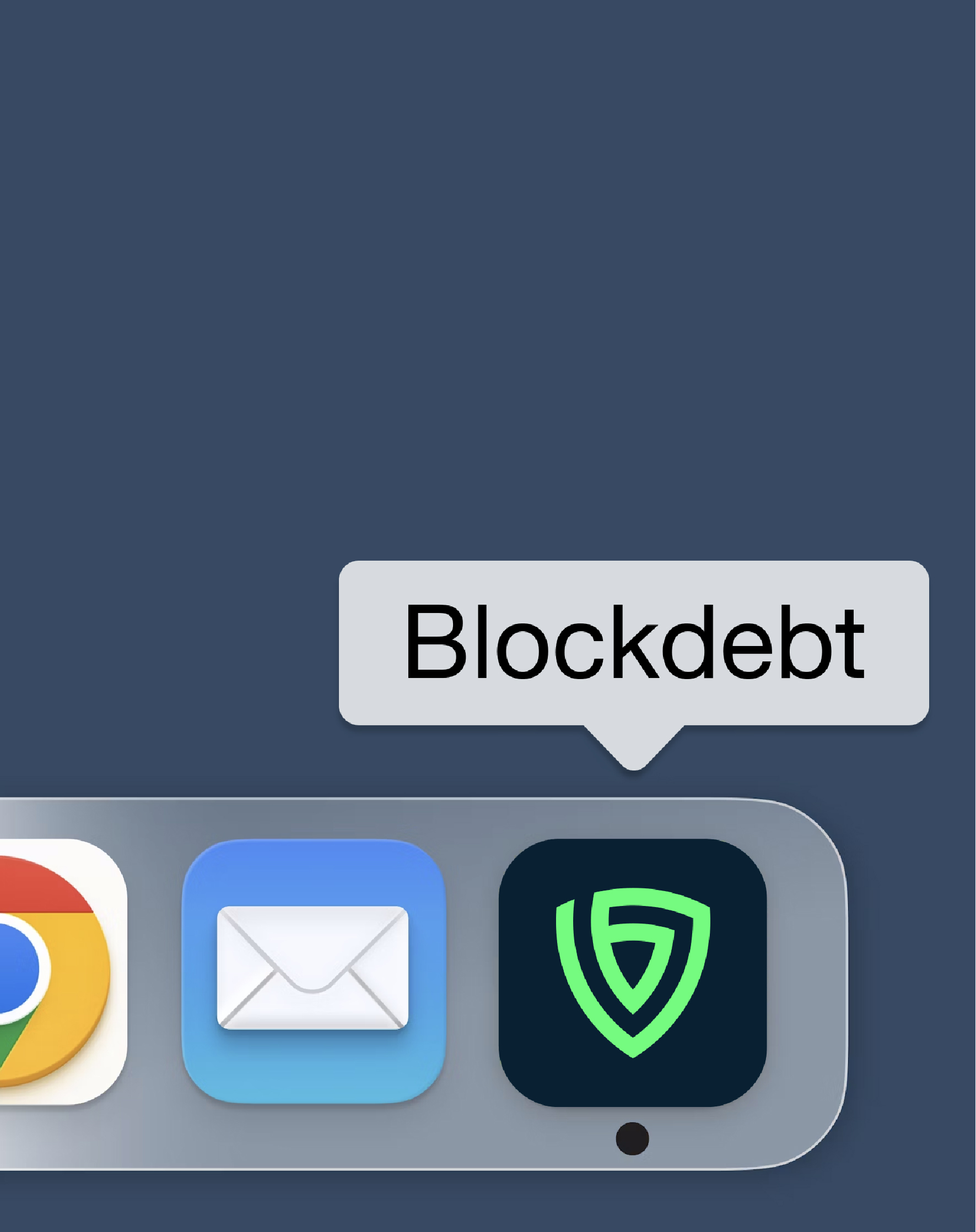
The creation of the shield logo was the big swing, to evoke immediately a sure sign of
safety, protection and solidarity to their customers. The unbroken line creates the shield
symbol with a central ‘b’ and a d in the negative space surrounding it. The logo is simple
to understand, yet rewards those who look closer. It was created as an emblem of
protection, perfect for those looking to work with a company that will keep them from
financial insecurity.
To fully explore the potential of a bold new brand, we centred our designs and messaging
around the maverick confidence of the team, and coupled this with the assured
protective partnership Blockdebt is built on. A new slogan incorporating the notions of
Strength and Streamline gave their stated purpose for their vision of a Property
Management Service, as well as a clear invocation of their desire to champion those who
pay ethically, and on time.
A small, but significant change was to recommend the move from their original company
name of Block-Debt to simply ‘Blockdebt’. A single word is easier to remember, more
recognisable and distinct. It also negates the harsh and unfavourable focus on the word
‘debt’. With these insights in mind, we took to the drawing board with gusto.
The design ethos was created around the holistic idea of circles, with the logo and a
series of icons made up of highlighted areas of the basic interwoven circular design. The
messaging was created to ensure their services were immediate and recognisable. New
customers would be enticed by the time saving and problem solving nature of
Blockdebt’s work, with a specific positive overview to welcome new business and soften
any negative implications of the word ‘debt’.
The central circles themes gives the brand a fresh new face, with an instant element of
safety, protection and solidity. Circles suggest motion, community, competence and a
robust resilience. All perfect offerings to new customers, while showcasing these crucial
professional pillars to their current clients.
The logo and icons are all part of a design language which emphasises and inspires the
notion of strength through partnership. The brand would now carry on these ideas, while
building on a central tenet of fitting perfectly together, retaining the whole while
Blockdebt works in tandem with their customer’s business.